THE BROWSER INNOVATION GROUP
At the beginning of Q4 2015 a group of 4 brave Cliqzers and I were put in charge of the "Bottom-up Development Center" project at CLIQZ. The goal of this small task force was to generate new ideas and develop a process for fast validation of early concepts.
The project lasted for 3 months, during which about 50% of my weekly working time was dedicated to it.
TEAM SETUP
- 1 UX researcher
- 2 developers
- 1 marketing guy
- 1 designer (that's me!)
- Rotating members from all areas of the company

THE PROCESS
To define possible areas of innovation we first focused on a macro workflow, which allowed us to explore different declinations of the product vision and overall strategy. We then concentrated on a micro workflow all about the generation of more defined concepts.
We soon found out that the best way to quickly validate ideas was implementing them as prototypes in short sprints.
The initial brainstorming sessions about broad topics were conducted each time with different members of company, to ensure a co-creation setting that took into consideration relevant stakeholders.
To then decide which ideas were worth bringing forward and which ideas were better left behind, each of us would have to come up with one or more concepts to pitch to the rest of the group.
Idea owners were required to answer the following questions:
- What user problem does the idea solve?
- How are users solving this problem currently?
- Is there something similar out there? (competitive analysis)
- How does the change affect users' behavior/habits?
- What are the benefits for users and Cliqz?
- What are the constraints for users and Cliqz?
At the end of the pitching session the group would agree on a winning concept to bring to the next phase: designing and testing.
The following is an abstract from one of the sprints:
LIVE EVENTS MONITOR sprint
This particular one was part of a short sequence of sprints that explored how a proactive browser that acts on the user's behalf could effortlessly serve the user relevant information.
Our product already has instant results for some categories of live events, but the user still needs to make the active effort of checking multiple times for the progress of events. Since search queries that lead to results containing the status of a live event that has not yet ended express an interest in knowing the future progress of it, I pitched the idea of a browser feature that proactively informs the user about changes of status of a live event such as the score of a soccer match, a flight status, a parcel delivery, an eBay auction etc.
From an engineering point of view this means introducing a reliable background process that checks for the progress of events the user has searched for. But how to notify the user once a change has been spotted? Finding the right space and the right way for showing notifications is a major design challenge.
I came up with a few rough sketches to visualize options.
We could, for example, simply show the updates in the CLIQZ Search dropdown as soon as they are available.
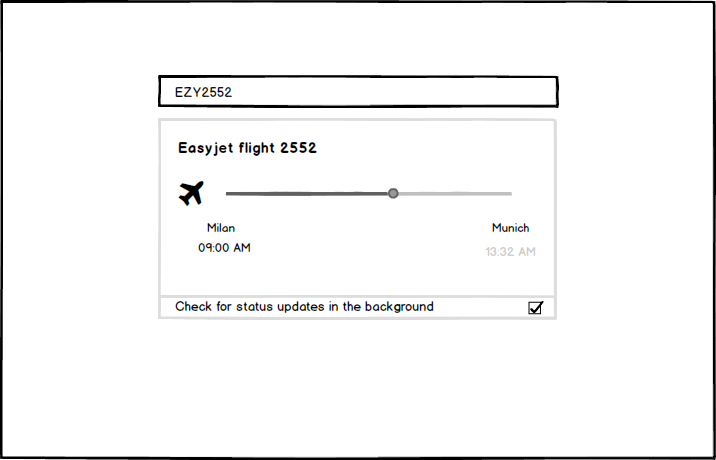
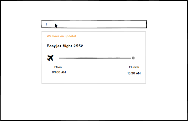
That would spare the user some typing, but it still requires her to interrupt whatever she's doing to check if updates are available.
We could instead create a dedicated space for the updates...
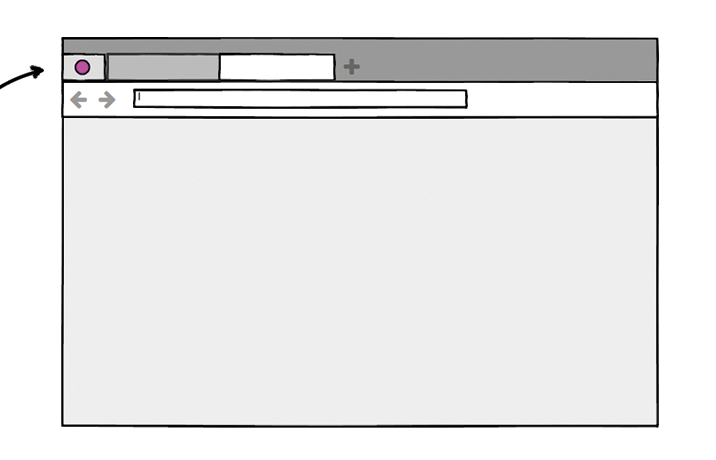
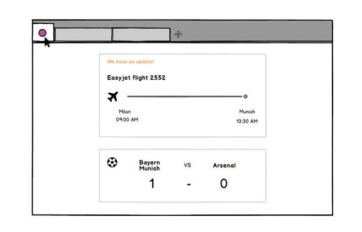
...and add clues to suggest wether something new is there, but possibly without overwhelming our user with excessive pop-ups and distracting messages.
I did a couple of visual investigations along these lines.
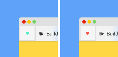
Subtle change indicator
(minimum amount of information - yes/no)
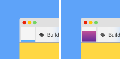
Color = Quality
Fill = Quantity
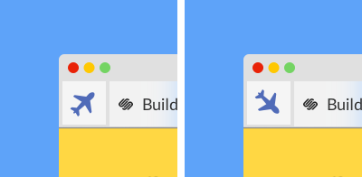
Telling more with just one icon
In the end, aware of the constraints imposed by the available time and resources, we decided to go for the option that was the best possible trade-off between a user friendly interface and a solution that was reasonably quick to implement as a prototype.
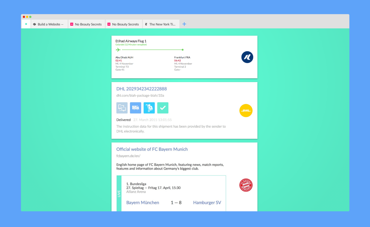
While the developers worked on making a functioning demo, I paired up with our UX researcher to define goals and methods for testing.
We finally tested internally with 3 users, creating a narrative that would concentrate the user task on a specific use case. We then analyzed our findings and were able to isolate a few major issues but also bring home some positive feedback regarding the potential of the feature itself.
Final Learnings, success and failures
The biggest challenges we encountered in the Bottom-up Development Center project revolved around giving shape to a new process and way of thinking about the future of our product. We made mistakes, and refined our process sprint after sprint.
We brought value to the company by producing valuable insights for the product management, and gaining technical knowledge that as already been proven useful to the development of current projects. The design team, on the other hand, can now benefit from the learnings we made relative to the design process for both incremental and disruptive changes.
Examples of topics we concentrated on in other sprints:
- Login-less browser
- Quantified self
- Distraction-free search
- Live channels
- Current path navigation
SHAPING THE DESKTOP BROWSER HOMEPAGE
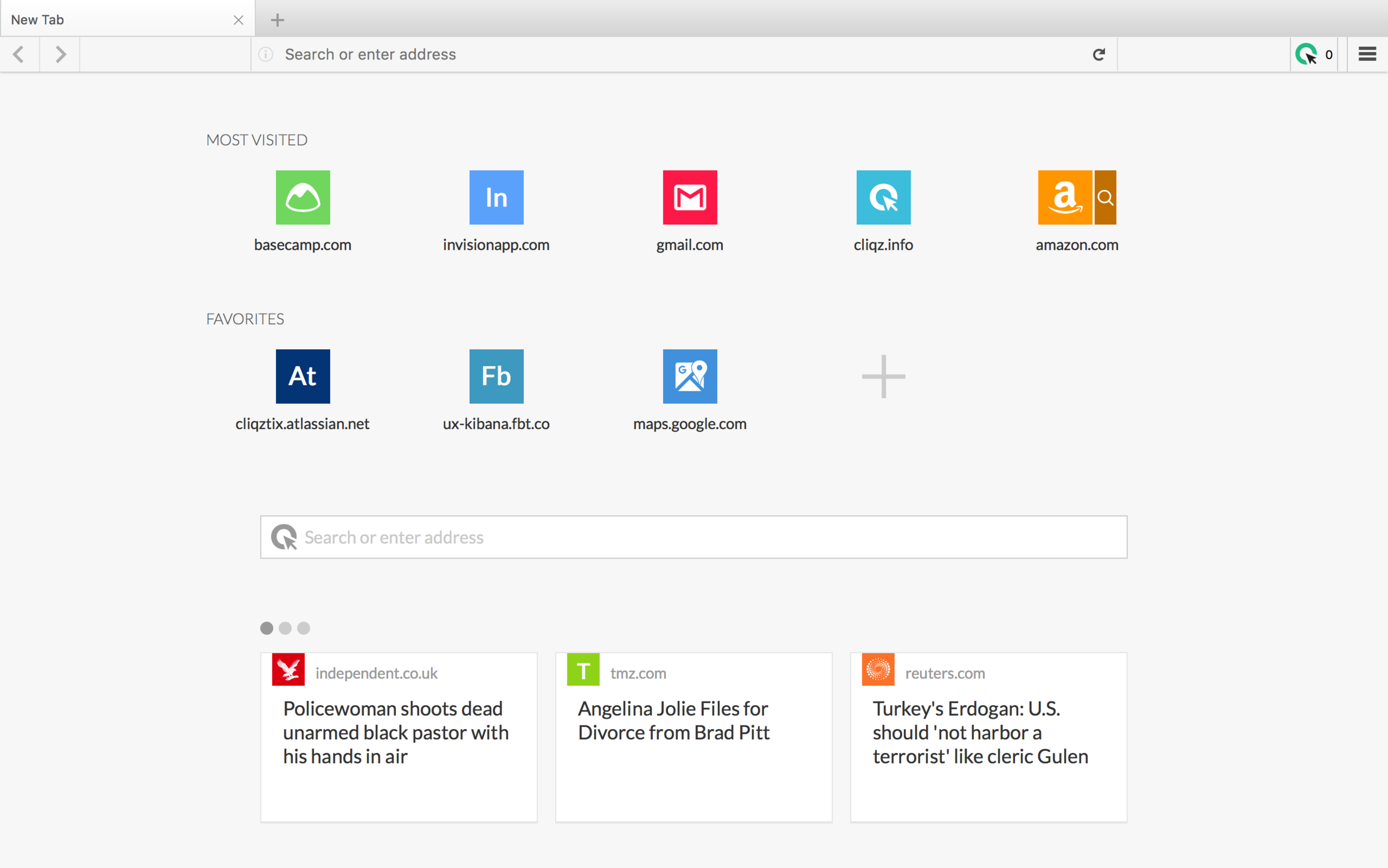
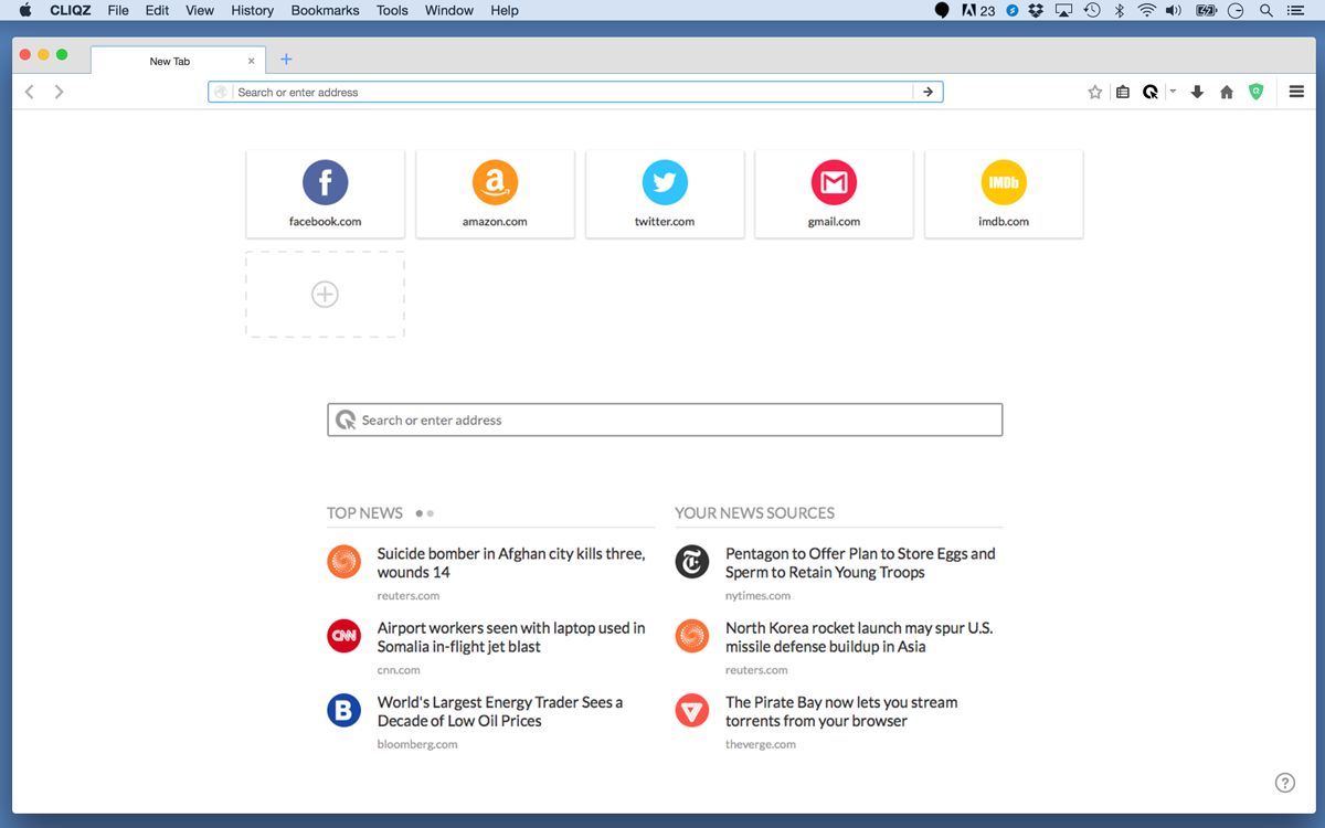
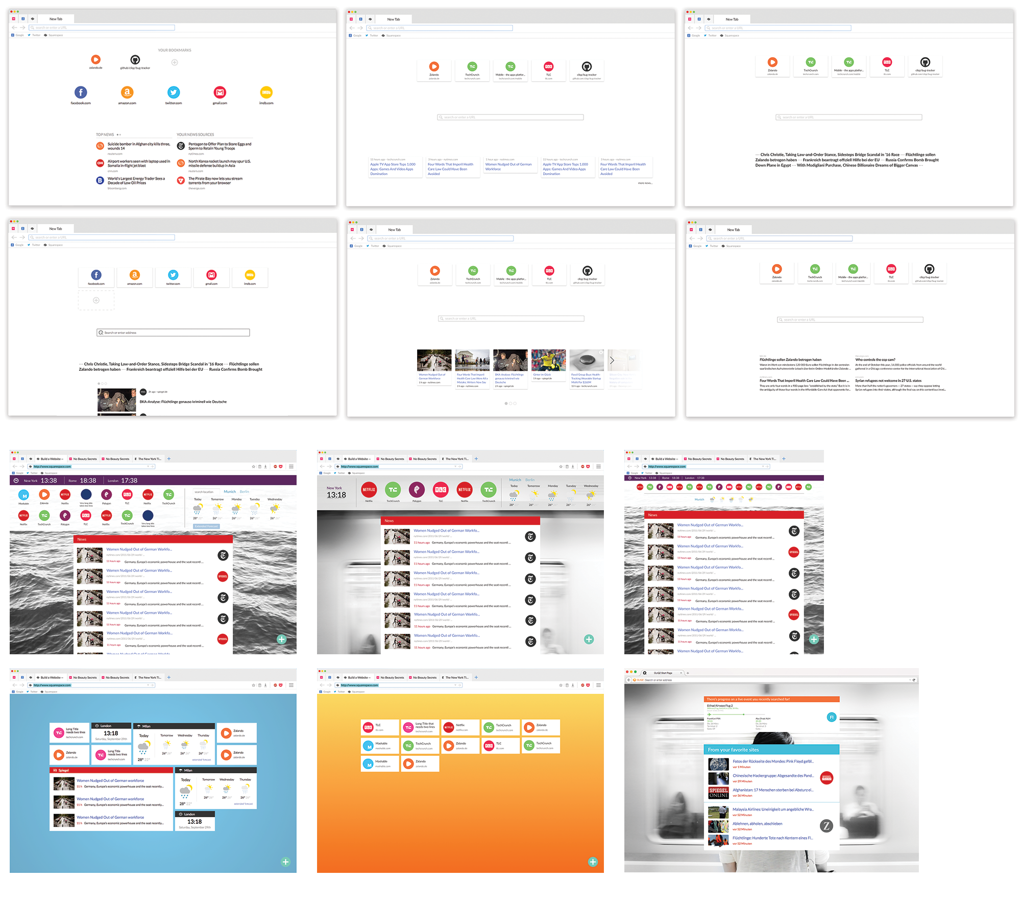
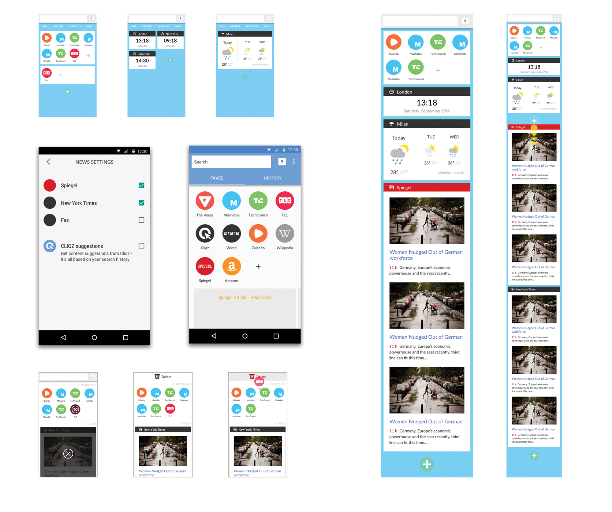
At the moment, I'm the lead designer on the redesign of the home page of the CLIQZ Desktop Browser and CLIQZ Firefox extension. My job is to give shape to the very first screen users see when they open the browser, and then again when they decide to open new tabs.
CHALLENGES
Because of the criticality of this space in influencing the user experience and because of its potential to bring value to the company in the future, this project comes with the challenge of having to constantly understand and balance between the interests and points of view of many internal and external stakeholders.
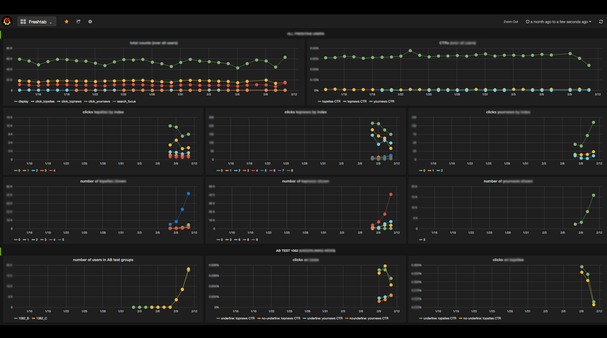
DATA DRIVEN APPROACH
As the pool of users seeing the home page expands, we get to collect data about their behavior.
Together with the UX researchers I get to discuss what the numbers mean and use them to inform my design decisions.
We also conducted in-house user tests to discover usability issues and get qualitative insights on our users.
EXPLORING MOBILE GESTURES TO delight users and prompt donations
During my time at iconmobile I had the opportunity to contribute to a variety of mobile-related projects taking on concept, research and design tasks. One that I particularly enjoyed was an exploration of mobile-specific gestures and interactions I did while supporting the design team that was developing concepts for a mobile app for the United Nations World Food Programme.
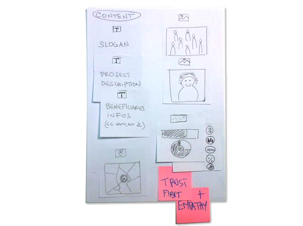
The client's goal was to push people to donate money to an hunger relief program through the app. To do so, creating trust and a feeling of social connection are great drives. An overall pleasant user experience is also important if we want users to repeat an action, and being this a micro-donations app repeated payments are strongly desirable.
My part was to come up with a creative selection of ways to encourage the user to go through the payment process and repeat it.
PROCESS
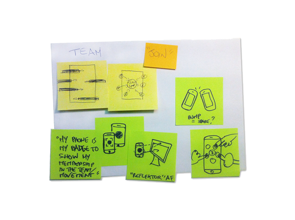
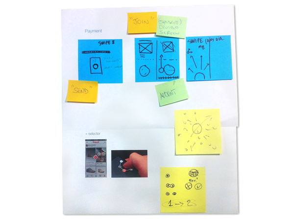
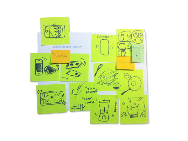
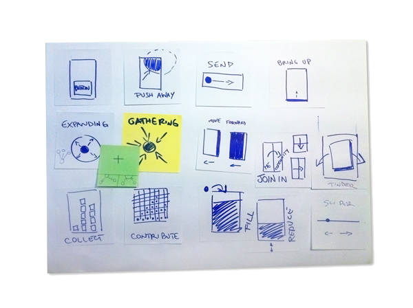
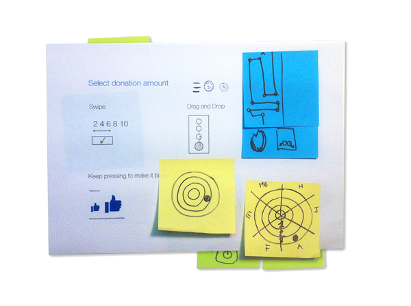
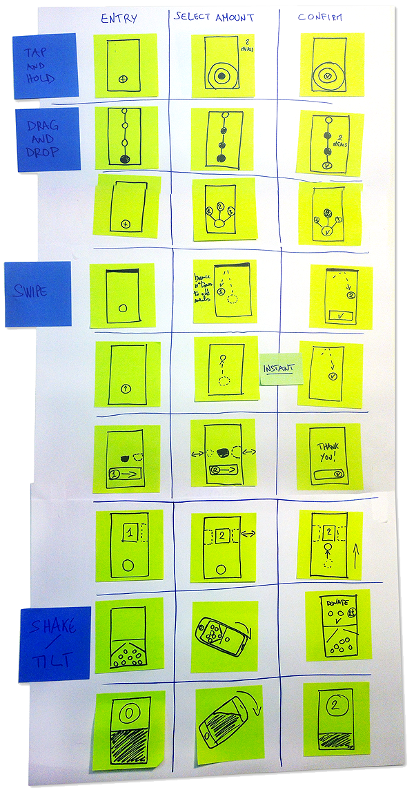
The approach I took, was that of first comparing existing apps that are simple and addictive to use, as well as successful in bringing delight or surprise. I then generated a number of options that focused on different goals and high level conceptual interpretations of these. Finally, I narrowed down the options, clustered them according to gestural patterns and defined the different states for the three main steps of the payment process (entry point, amount selection, confirmation).
CONCLUSIONS
My final output consisted in a presentation of the most promising options, containing a list of mobile gestures and interactions grouped according to the purpose they could serve better. I also made a few wireframes and paper prototypes of some of the payment process options. The lead designers were able to use this as a base and inspiration for the concept and interaction design of the application. Additionally, this served the agency and my former colleagues as a reference for future projects.